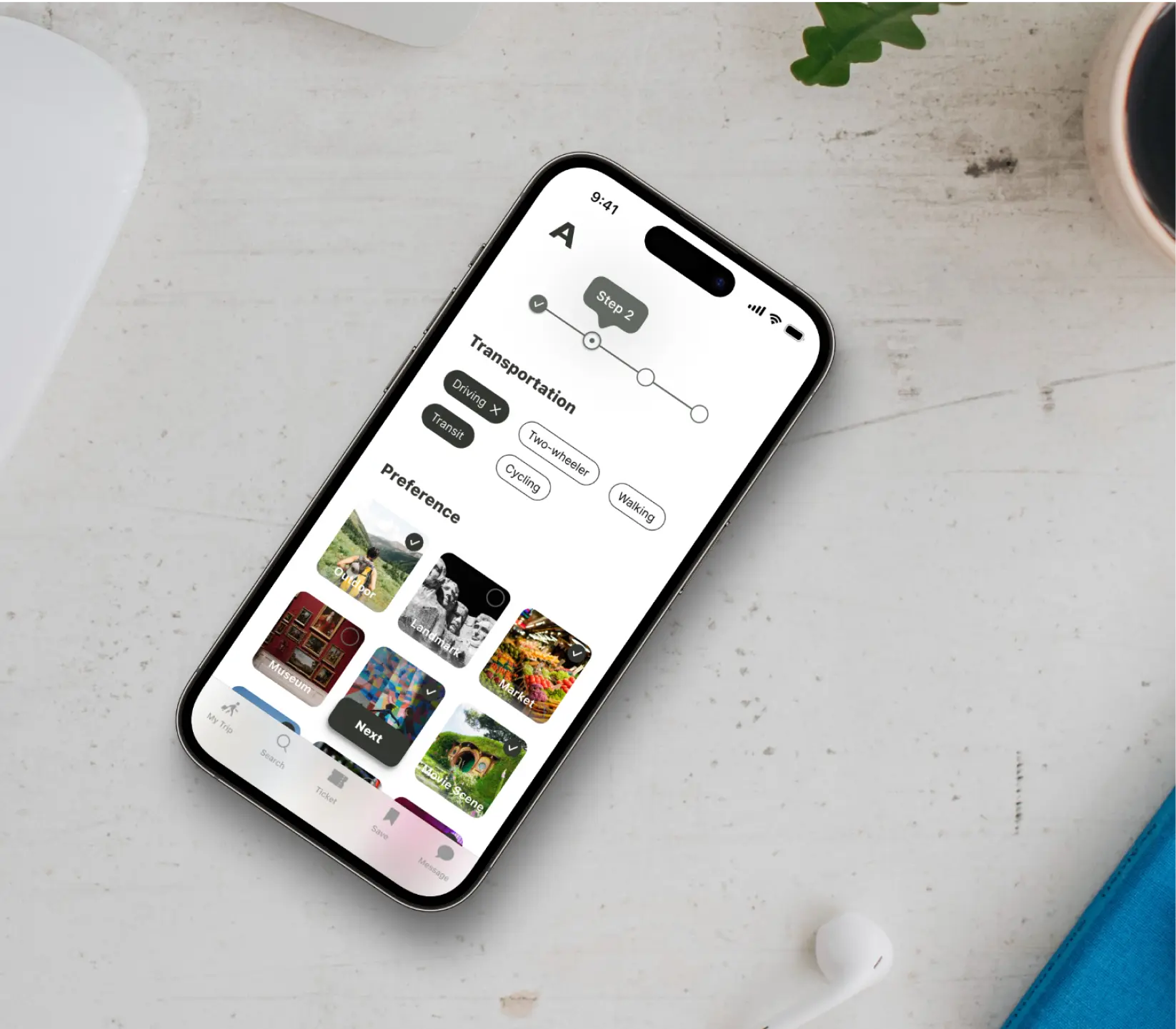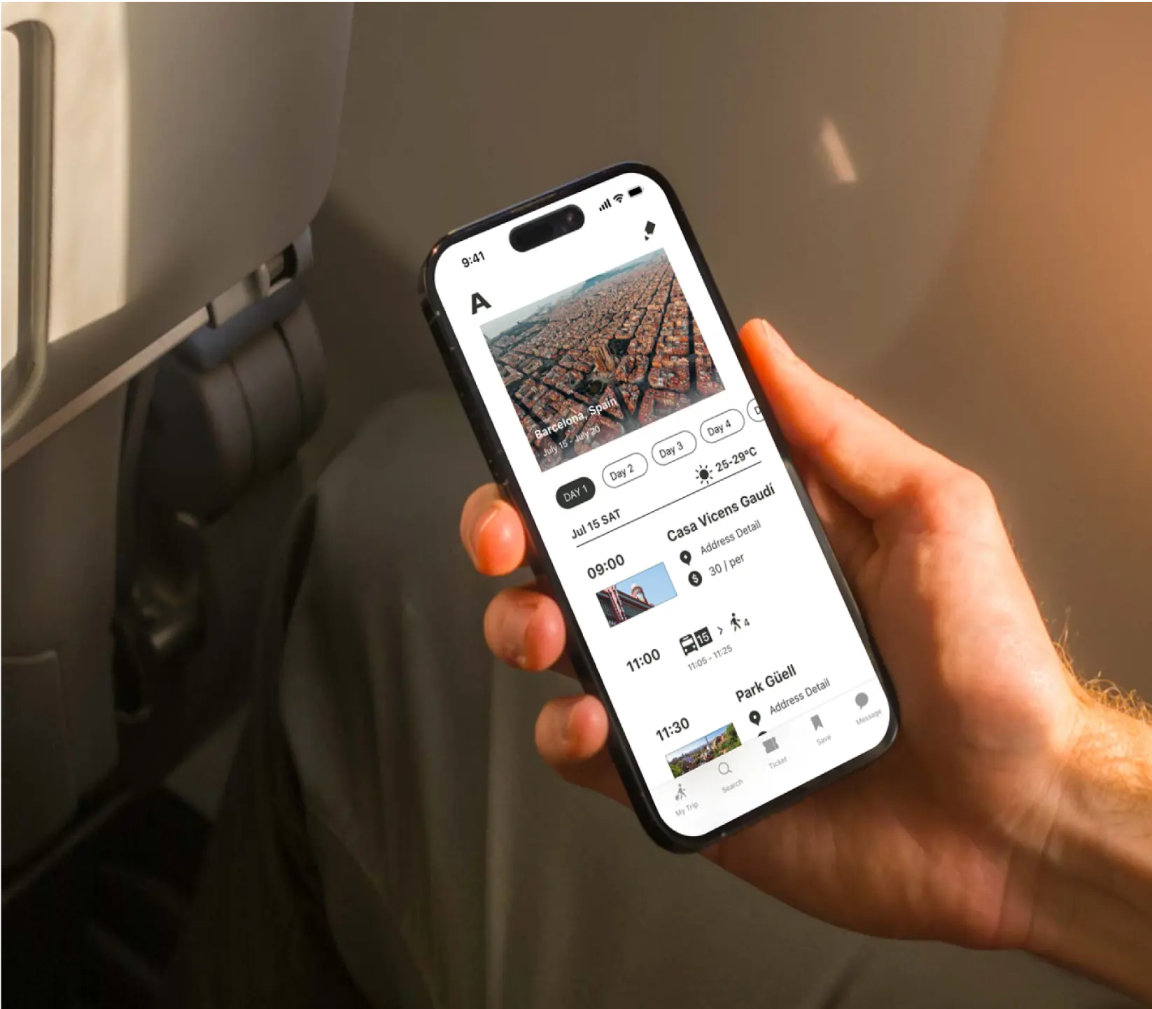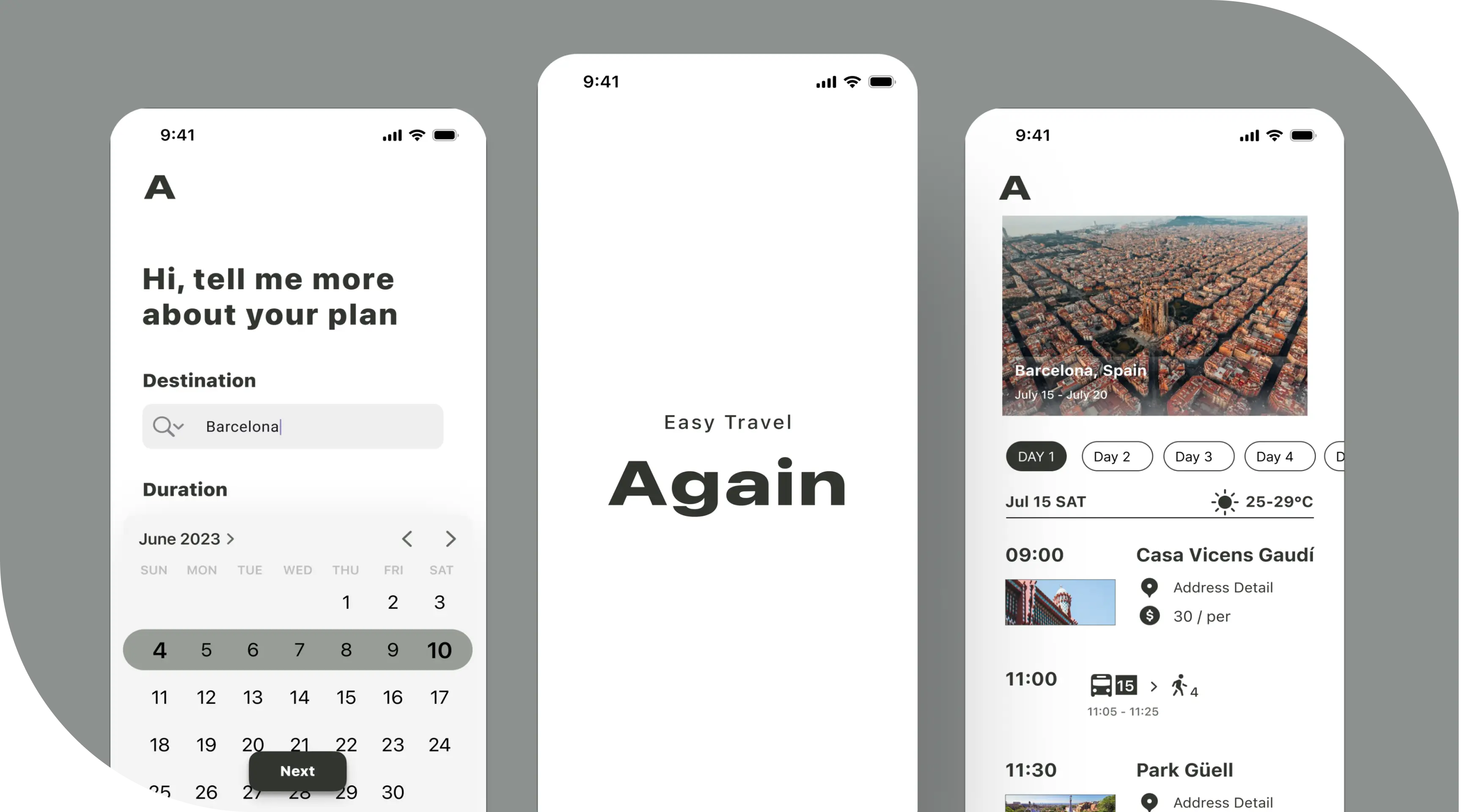
Again - Easy Travel
Roles : UX/UI Designer
Duration : 4 Weeks
Overview
Post-pandemic travel has brought new challenges for international travellers. This startup's mobile app aims to simplify trip planning for people, helping them navigate the evolving travel landscape. By addressing the unique needs of today’s globetrotters, the app ensures a seamless and optimised travel experience.
Research
My research first centred around the one-on-one interviews would help me understand users’ travel planning process (solo or in group under 4) and identify specific pain points to address. Secondly, I would observe the competitive landscape to see how other travel apps are addressing similar issues.
As a User Researcher, I want to understand
- I want to understand the step-by-step process of how people plan their leisure travel.
- What make travellers worried during trips?
- How travellers feel about popular overcrowded travel hotspots in bucket list.
Research Methods
1 X 1 interview
5 Interviewees
20 Interview Questions
Challenge
After conducting user interviews and creating an affinity diagram, I found Interviewees...
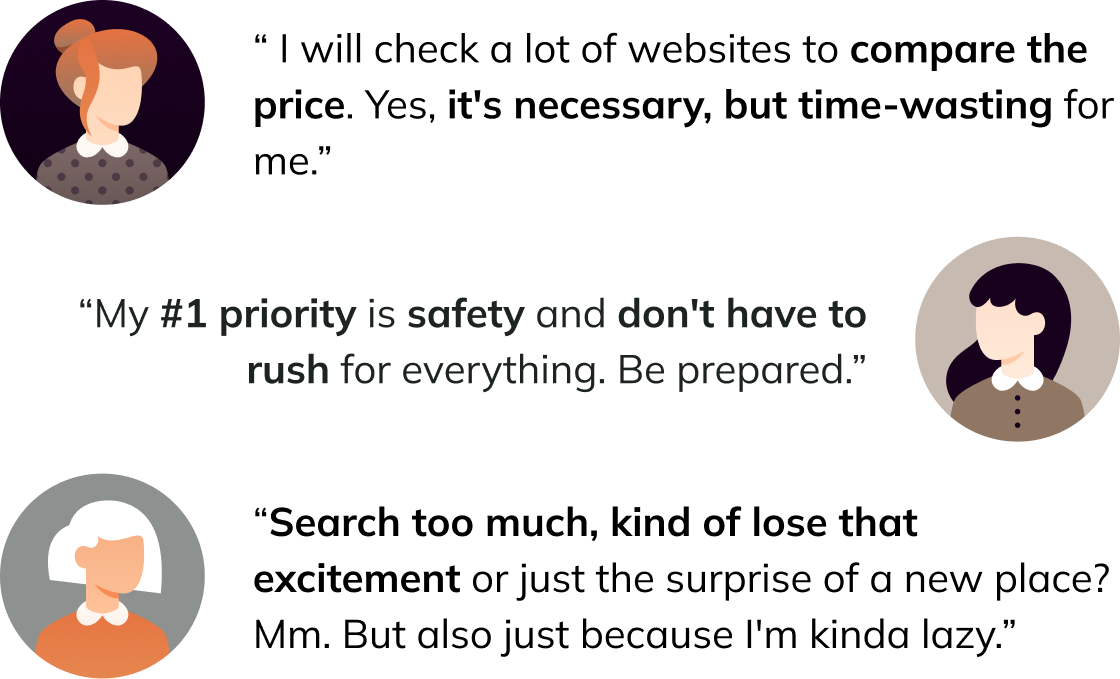
Wish to avoid crowded places when travelling : Travelling to crowded places adds stress, with long lines and less enjoyment, making it harder to relax and navigate.
Set Budget First : Everyone loves a cheaper price—who doesn't? To make every cent count, they need to compare prices across different websites.
Spend a lot of time on researching : On average, they realised they needed to spend two more weeks arranging the itinerary, including checking the open hours and transportation.
Problem
“Travellers aiming to avoid crowds and stay within budget often face stress and spend up to two extra weeks on research, including price comparisons, open hours, and transportation planning, reducing the overall enjoyment of their trip. ”
PainPonit
"
Solo and small groups of travellers need to have a smart itinerary because planning a hassle-free trip under a limited budget requires spending a large amount of research time.
"
Ideation
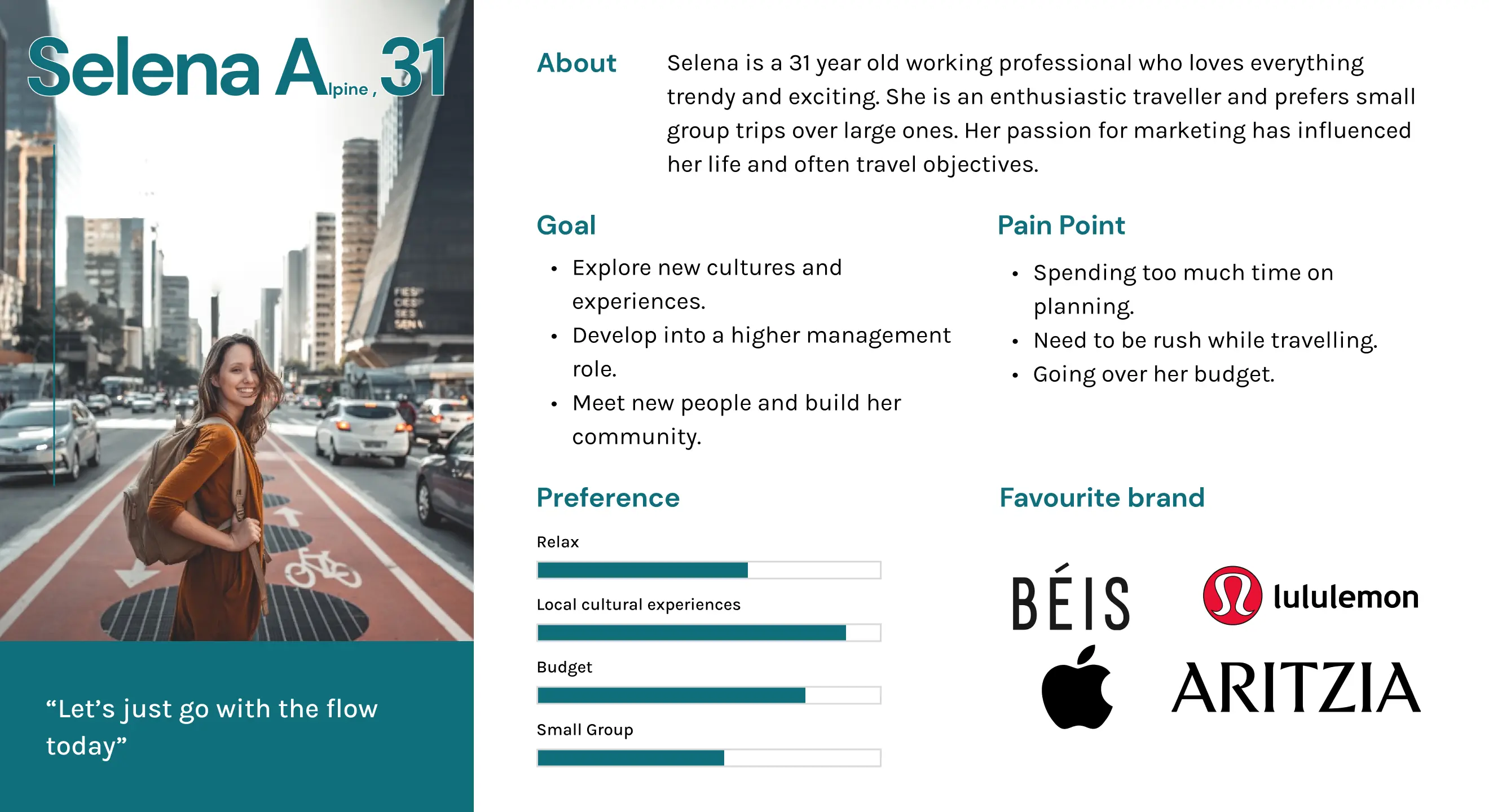
User Persona
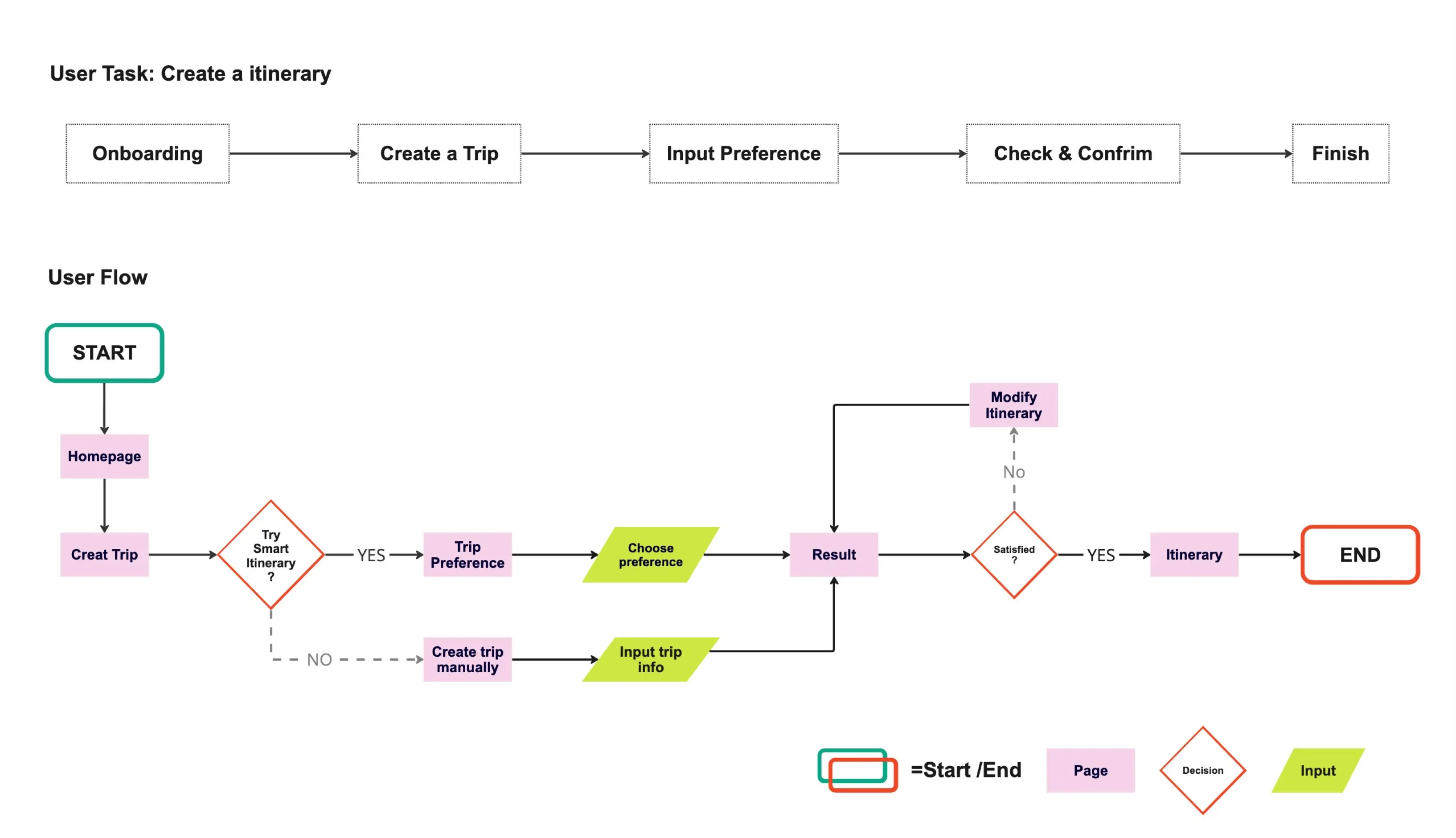
User Task Flow
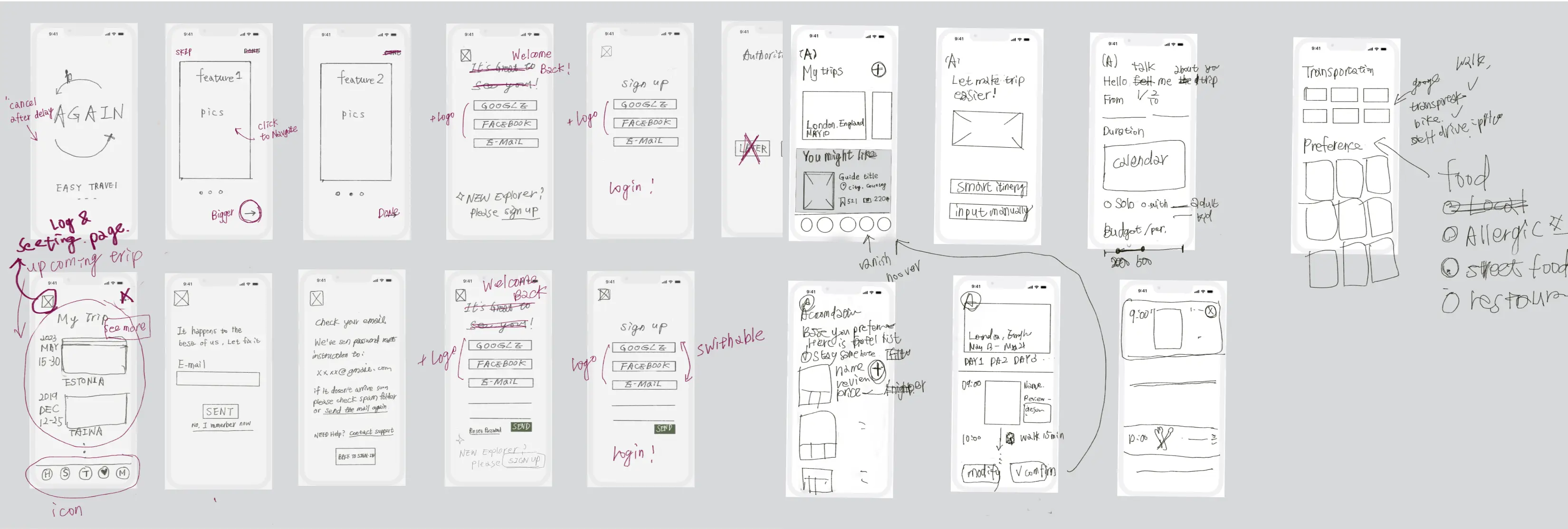
Sketch
Prototyping
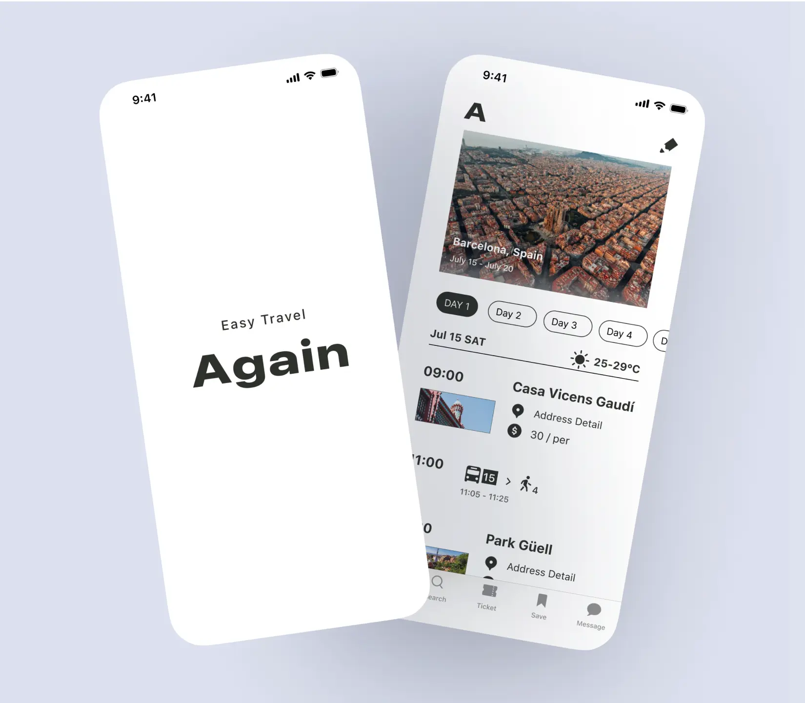
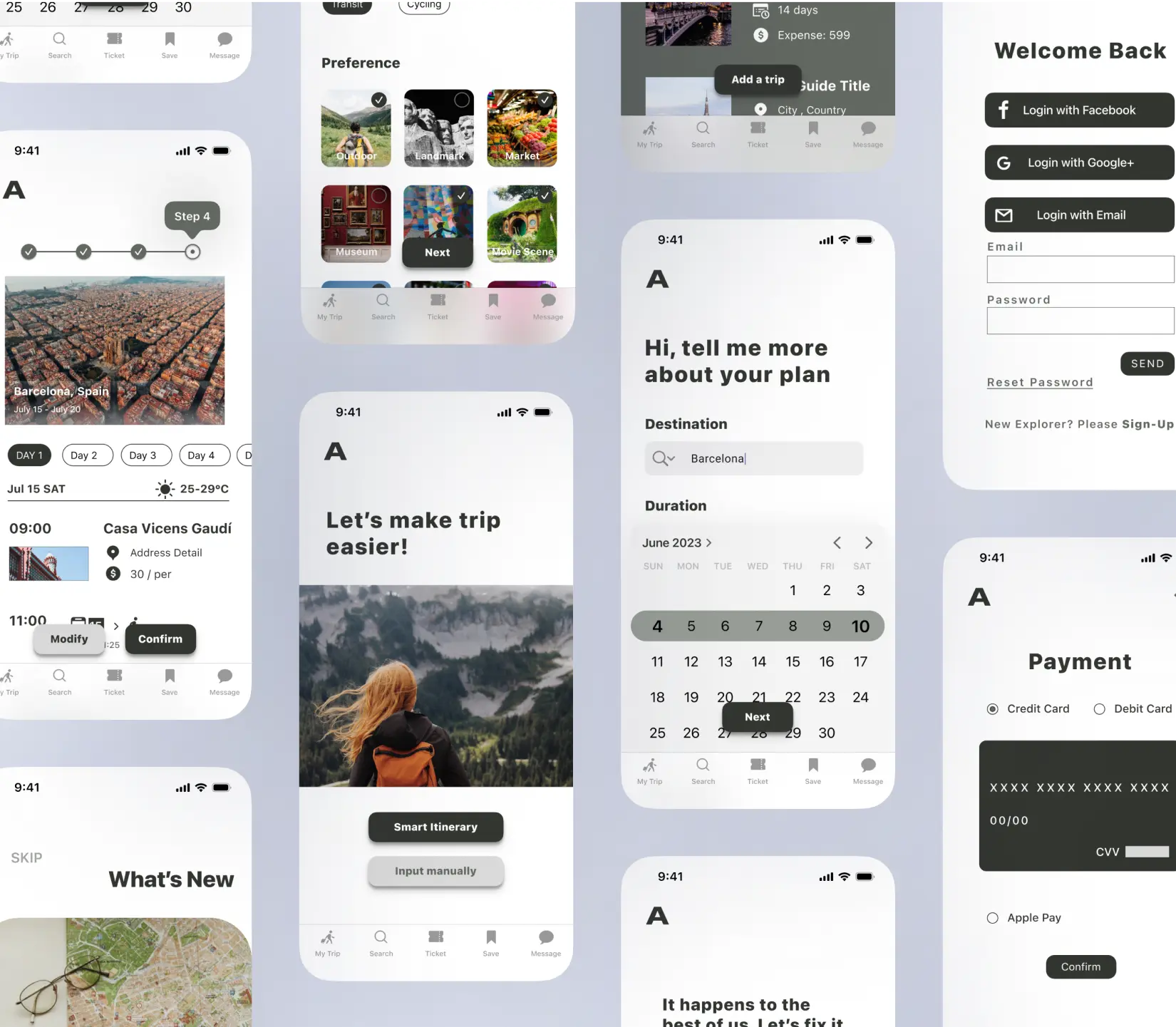
Mockup
Testing
User Test
What's the tester said?
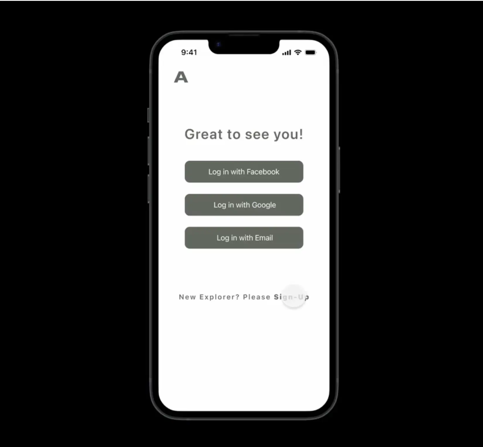
"Make the button more intuitive by placing an icon on it."
“Enhance the intuitiveness of the coaching page.”
What can be improved?
Enhance the buttons to guide users on the next steps.
Iteration
Before
After
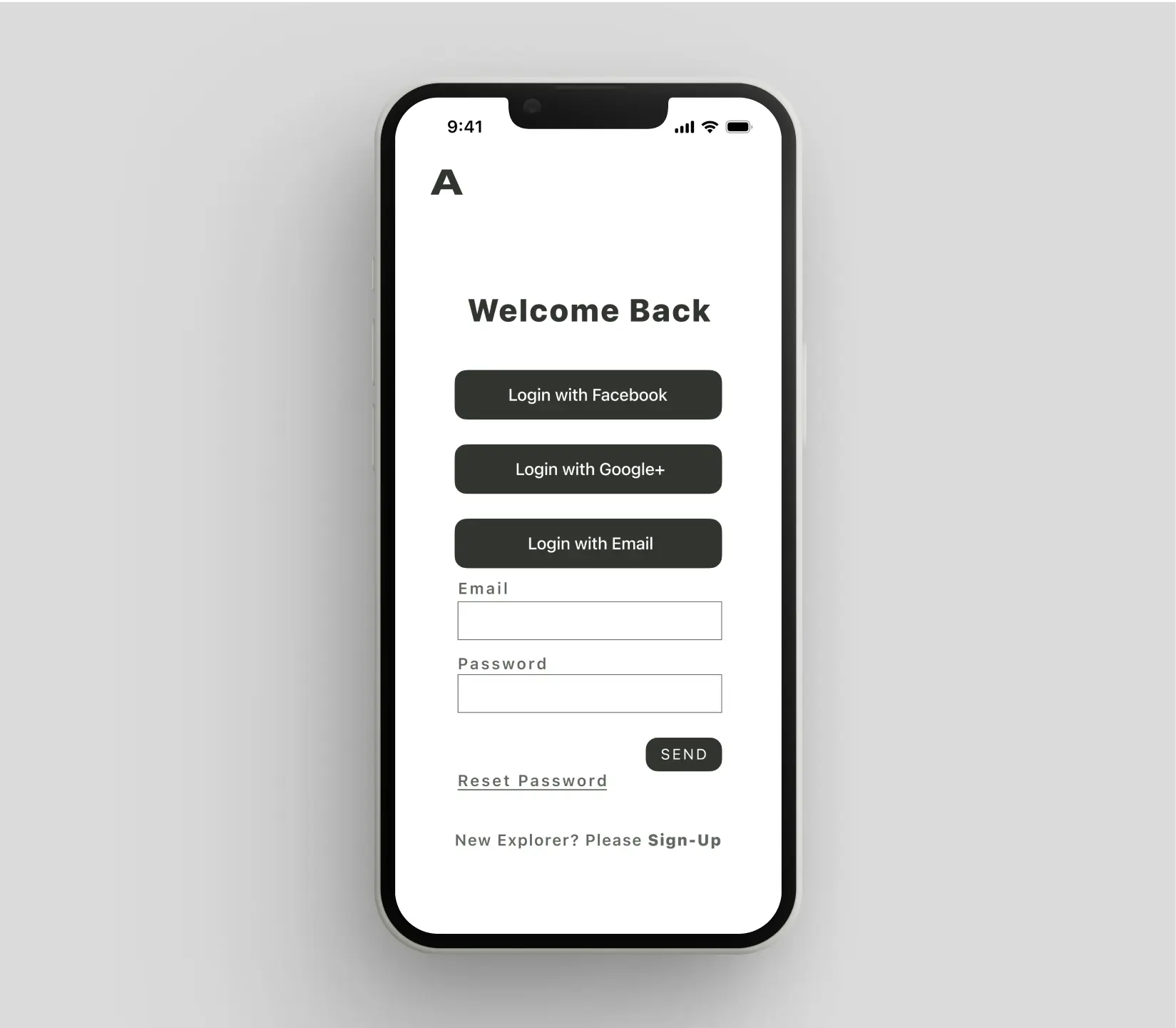
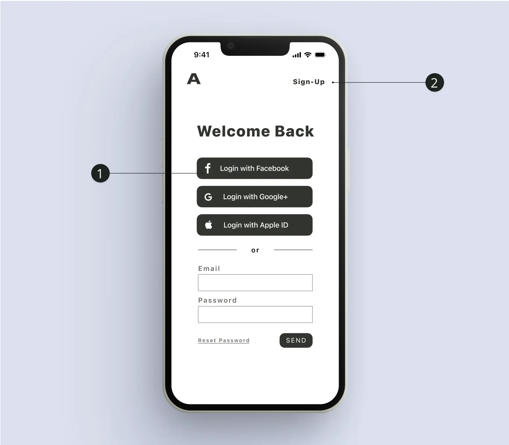
1. Add an icon to the button.
2. Place the Sign-Up in a clear and prominent location.
End Result
